|
Production Guidelines
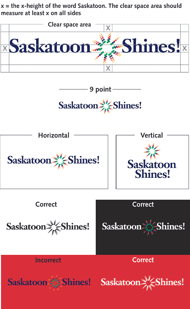
These guidelines show the correct treatment of the Saskatoon logo
in advertising, packaging, correspondence and promotional materials.
The logo must not be altered or manually reproduced in any way.
Trademark
Saskatoon Shines is a registered trademark, and because Saskatoon
Shines is registered with the Trademarks Office, the ® symbol
does not have to accompany the logo.
Clear Space
No other graphics, type, or illustrations should enter the clear
space area.
Size Relation
The symbol and the text should be used in a ration of 2:1.
Minimum Size
Do not print the logo with slogan any smaller than 9 points in width.
On the Internet and TV, do not publish the logo digitally smaller
than 90 pixels in width.
Space Relations
Only use the official Saskatoon Shines logo in the preferred horizontal
and vertical formats shown here.
One Colour Application
Use black or white applications if the logo falls on a background
colour other than black or white. If black is the background colour
then use the “colour reversed” version of the logo.
Correct Colours
Logo
Green - C-80, M-0, Y-90, K-0
Blue - C-100, M-68, Y-0, K-12
Red - C-0, M-100, Y-81, K-4
Orange - C-0, M-61, Y-97, K-0
Yellow-orange - C-0, M-28, Y-100, K-6
Yellow - C-0, M-16, Y-100, K-0
Text
Blue - C-98, M-100, Y-0, K-43
Typeface
Janson Bold
Upper and lower case
DOWNLOAD
PDF of Saskatoon Shines Graphic Standards.

|

